Claudia Rubín
November 18, 2020
One of my earliest design memories, though I didn’t recognize it as such at the time, is of digging through a cardboard box of my mom’s old New Yorker magazines as a kid. She had saved hundreds of issues but I couldn’t find a single one I wanted to read. Don’t judge a book by its cover, they say. But it was the covers I liked! The insides, which made no effort to entice, were the turn-off. There was too much tiny text, no color, ads everywhere, and only a sprinkling of cartoons to break up the unbelievably long articles. I abandoned the box.
I think about design more consciously now than I possibly could have then. Looking back, there was no miscommunication between me and The New Yorker. It wasn’t that I didn’t get or like its look. The magazine was telling me something and I was reading the message loud and clear. It was saying, with it’s no-design design: we’re serious, we’re high-minded. We’re not for kids — but we’re also not for every adult either, we’re niche. These days I’m a subscriber to The New Yorker, more compelled by its substance than its surface, but I still think a lot about what signals it and other publications send with their graphic design. Visual language — brand identity, aesthetic, vibe, whatever — communicates more than just a sensibility; it can invite or exclude, be expansive or esoteric, enforce hierarchies or push boundaries. It makes plainly visible the values and ethos of an institution.
Claudia Rubín has worked at The New York Times Magazine since graduating from Syracuse University three years ago. Her work at the magazine captures my attention every week, drawing me into each story, compelling my curiosity. I’m sure that I would have responded to Claudia’s style as viscerally as a kid as I do today, not because it is simple or “easy,” but because it is inventive, generous, and playful, alive with joy and optimism. As she made clear in our conversation, Claudia thinks about the function of graphic design — its ability to convey information effectively — first. At the same time, she understands that visual communication can be coded, for better or worse, embedded with assumptions about class, race, and gender. Claudia, who is from Puerto Rico, appreciates graphic design’s power and potential and also questions the design world’s rigidity. She asks: What would meaningful representation look like in a homogeneous industry? Which design norms do we take for granted? How can visual story-telling be innovative and also practical? It is both the delight and the skepticism Claudia brings to her work that inspires me.
This interview took place between July and October of 2020. It has been edited and condensed.

Georgia Hilmer: Before the pandemic started, when you were able to work from The New York Times office near Times Square, what was a typical work week like for you? How much of the design process is collaborative and how often are you working solo?
Claudia Rubín: During a normal week at the magazine, pre-pandemic, on Monday I would get the word count for the story I’m working on and photo selects from the photo department. Basically I have to make an initial layout to make sure the words fit and the photos fit, with photo options for everyone to see. Those would get approved between Monday and Tuesday. I normally get a headline for my story on Tuesday and from there I start designing and making options to show my boss.
Sometimes designing is easier, sometimes it’s a lot harder, depending on a lot of factors: the topic of the story, the headline, how good the photos are. I’m normally done with the design on Thursday and then the tweaking of small details get finished by Friday. Then the story ships and we start again the next Monday, and the next Monday, and the fifty-two Mondays of the next year.
Other times the process is a lot longer, like when there is an illustration to commission. Certain stories aren’t as straightforward or call for a more conceptual image, so instead of using photography we commission illustrations. I love this part of the job because you either get to work with new illustrators, which is super exciting, or you get to work with illustrators multiple times and build relationships while watching their work evolve. I also design some front of book stories on a weekly basis as well. Those tend to be more straightforward because they’re recurring.
As far as collaboration vs. working solo, it is usually a single designer working on a single story. When there is a special issue where a whole issue is dedicated to one topic, one designer leads the project and a couple of designers will help them out with whatever they need. Running an issue is so much work in itself. My work is mostly solo but there is always some element of collaboration.
What are some of the limitations you face (besides the rush of producing new stories every week) as a designer working at a news organization? How weird and experimental can visuals get?
There can definitely be limitations with the pace of the magazine but they can actually be a good thing. What I do on a weekly basis comes down to making a headline, a deck, and a byline look good next to a photograph or an illustration, making you want to read a story. The design is a visual invitation to the writing. The first limitation is readability. Design can and should be pushed when possible but the whole point of editorial design is for the reader to be able to read text. Thankfully we have an editor-in-chief, Jake Silverstein, who is super visual and understands design. He’s open to us experimenting. Another limitation is sensibility. Some stories are fun but others are very serious and the most important thing then is for the design to be respectful. For example, I will likely not get too creative or “out there” for a story that focuses on Covid-19 deaths. The design for those kinds of stories is a lot more stripped down. Knowing when to step back is part of the job.

A spread from the August 11, 2020 issue of The New York Times Magazine. Claudia designed the lay-out and commissioned illustrations from John Karborn for the piece, which is about cytokine storms and Covid-19. It was written by Moises Velasquez-Manoff.

How has the pandemic changed your work life?
The pandemic has changed my work life drastically. First of all, I work from home. Making a weekly magazine with none of us being in the same room is super challenging. Not seeing printed proofs is scary. But we make it happen. We ship the magazine every Friday and again and again. It’s wild. Living in a pandemic and having this sort of front row seat to it is overwhelming. It’s hard to process it all when you’re working on it everyday. You kind of have to detach yourself from it. I’m blessed to be working and happy to be here. Complaining about anything in any way feels ridiculous. It’s so surreal that I’m living in the city that was the epicenter for the virus and I’m working at the news publication that is informing everyone about what’s happening in this historic, tragic, crazy time.
Your parents both work in advertising. You went to Syracuse University and studied Communications Design. How did you decide where to go to college? What was it like to leave Puerto Rico to attend school in New York? Did you have a mentor at Syracuse?
I honestly always wanted to go to Parsons and I got in but they gave me almost no financial assistance at all so I had to go with Plan B. I had gotten into Syracuse as well — my mom actually went there and studied the same major. I went and visited and liked it. Six other people from my high school class also ended up going at the same time as I did. Leaving Puerto Rico to go to school in upstate New York was such a culture shock. First of all, the weather was such a big change, I had never seen snow before in my life. And then culturally speaking, I grew up on a small island in the Caribbean, where almost everyone shares the same culture and speaks the same language. Having the opportunity to go to school and meet people from so many different countries and walks of life was incredible and eye-opening. That experience was a whole school in itself.
I had two professors in my major who really shaped my education. One of them was Michele Damato, who pushed me so hard but also made me laugh. She forced me to think conceptually as opposed to making something that is just nice-looking. She also taught me how to be critical of my own work and accept criticism of my work. She gave me thick skin through her class and was a great mentor. Another professor was Jeff Glendenning. He introduced me to magazines, he introduced me to The New York Times Magazine. He’s one of the reasons I am where I am today. He works at the Times, I see him all the time in the building (or I would, pre-covid.) They both really shaped my education and my style and made me the designer that I am becoming.
After graduation you quickly started freelancing as a designer at The New York Times Magazine. You have described that initial period after being hired as daunting — something like impostor syndrome kept you from asking questions when you were struggling. Eventually the feeling passed. How did that job come about? Can you talk about how you have dealt with fear and doubt as a young person working at such a historic institution?
In the spring semester of my senior year I worked super hard to wrap up my portfolio as soon as I could so that I could start sending emails and having anyone who would look at my work look at it and spread it like wildfire. At the top of my list of places to work was The New York Times Magazine. I emailed every single designer who was in the department at that time, expecting none of them to respond, but to my surprise Ben Grandgenett, who is the current art director at the magazine, responded. He said, “If you’re ever in the city, feel free to drop by and we’ll look at your work.” I made something up and told him I would be there the next week. I booked a bus ticket and went to New York with the sole purpose of showing him my work. I got there, went straight to my interview with him and had plans to return to Syracuse right after because I was going to graduate in a couple of days.
Ben asked me if I was going to be there longer because he wanted Gail Bichler [creative director of the magazine] to look at my work. I said, “Yeah, of course, I’m here for as long as you need me to be here. Who cares about graduation?” I stayed another day, showed Gail my work, then went back to Syracuse to graduate. In a week or so I went to Puerto Rico, was there for about two weeks and then received a freelance offer from Gail to start the following week. I accepted the offer and started my freelance gig at the Times at 22. After a few months it turned into a full-time position as a designer. I’ve been there for almost three years now as a full-time employee.
It all happened so fast, which is why I think I was so insecure at the beginning and why it was so daunting. I had no idea what I was doing. Seriously. It was my first job ever; I was working alongside industry titans. For the longest time, I was so hard on myself and put so much pressure on myself. That got even worse after I was hired full-time because I thought, “Oh any day now they’re going to realize they made a mistake and hired a child to do this work.” I felt like I was asking too many questions and I was wasting people’s time. My questions were always answered, everyone was super open and patient with me, the work always got done. Over time that feeling definitely started to fade and I started building relationships and friendships with my colleagues. I started feeling more comfortable in my role and confident in the work I was doing. Some of the fear of being a young employee at the Times came from this pressure I put on myself to know my place and stay in my lane. Literally no one has ever asked me to do either of those things — if anything they have encouraged the opposite.
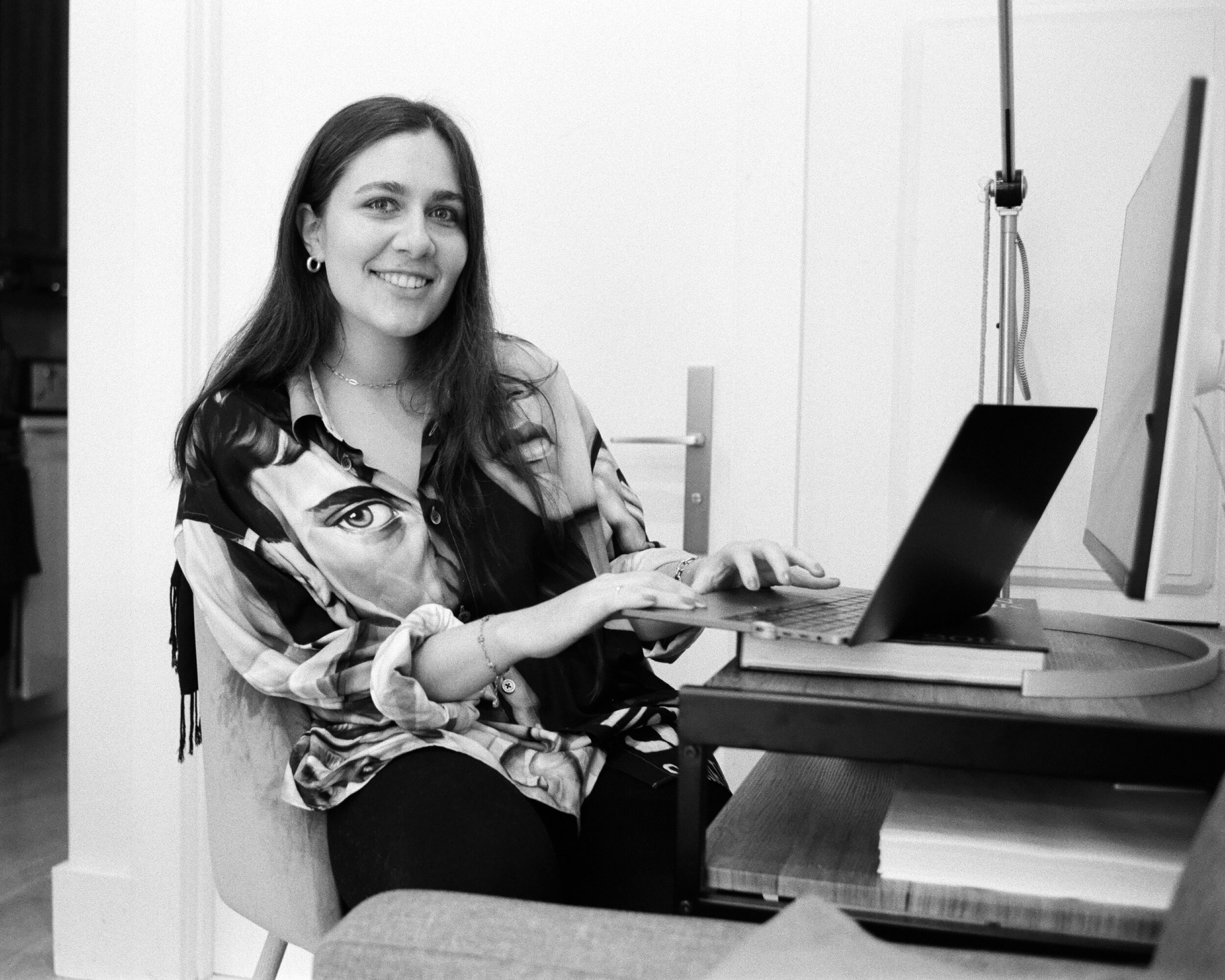
Claudia at the desk where she has been working from home since March.


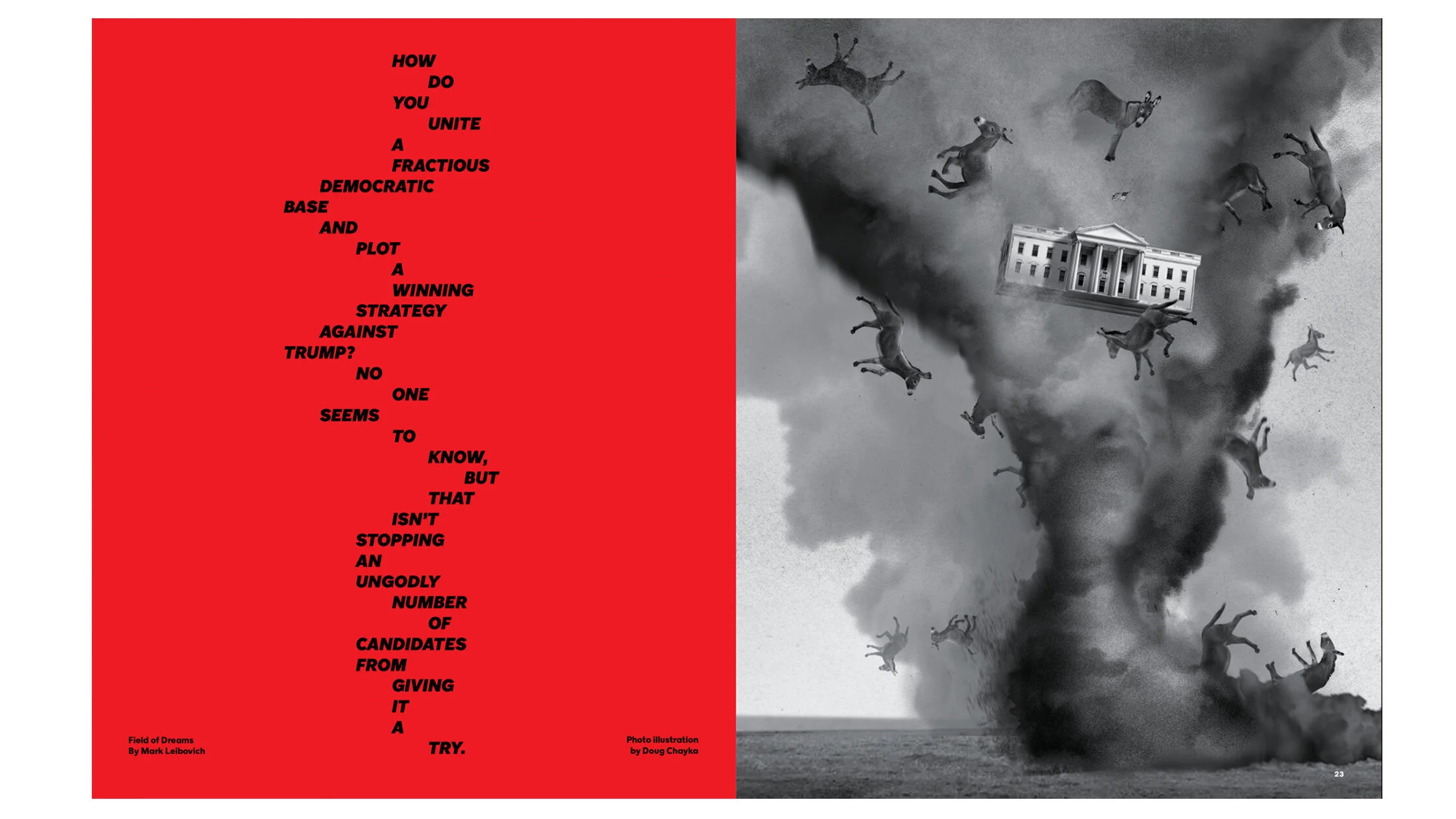
Some of my favorite examples of Claudia’s designs for The New York Times Magazine.
Puerto Rico and the United States have an extraordinary relationship that I think a lot of Americans don't often consider. I understand the dynamic as that of a colonial power occupying a territory and denying local citizens representation in government. There is so much hypocrisy and tyranny in U.S. management of the island. Growing up, how did you understand what it meant to be both Puerto Rican and American? Have the recent protests against racial injustice in the U.S. made you think about your own experience of national and cultural identity differently?
What does it mean to grow up both Puerto Rican and American? Damn. Welcome to the question of the century. I can’t speak for all of us but Puerto Ricans, specifically island Puerto Ricans, we have such an identity crisis. Growing up in Puerto Rico, it being a U.S. territory, there is a lot of smoke and mirrors. We are constantly sold the idea that we are just as American as mainland Americans. In addition to my own culture, I grew up bilingual from the age of five, watched American TV, listened to American pop music. The culture of my school was: get good grades because the best and only chance you have for success is to leave and go study abroad in the United States. In my experience, I was never made to feel like it was a viable option to stay, at least if I wanted to follow my dreams. Of course there is a lot of privilege in even having the option to do that. There are definitely more educational and job opportunities in the States.
I found that my identity was challenged a lot in being a white Puerto Rican in this country. I’ve gotten every sort of question. I’ve been asked, “What exactly are you?” I’ve been told to speak English. I’ve also gotten questions like, “Wait. How do you know what the TV show Friends is?” I know these are very different ideas — the first two things are very insulting and the Friends one is just silly — but they all have the same effect, which is just to make me feel that my identity doesn’t make sense. What I’ve always been told, what I’ve always thought, is that it doesn’t make sense and I’m an “other,” an outsider. I realized all this sense of American belonging I was made to feel growing up was just an illusion, an illusion that is created deliberately. If and when you move to the mainland, everything you thought and were told you were — it becomes clear you are not.
My first experience of my identity being challenged, directly at least, was on a school trip to Washington D.C. when I was thirteen. The program included my class from Puerto Rico and kids from a different state. They asked us if we came in canoes to D.C. I remember all of us being flabbergasted. We had each other and we could collectively respond to how ridiculous they sounded. When I got to Syracuse and had to deal with these questions on my own, it started to feel lonely and isolating. While the entirety of my identity is up for debate to many people (and sometimes a question mark for myself), what I do know is that I’m Puerto Rican and half-Cuban and I’m very proud of my heritage and my culture and where I come from. Puerto Rico just keeps getting hit and it keeps being resilient. People on the island are tired but they keep going.
The recent protests have forced me to challenge myself and have sparked super important conversations within my community, between me and my friends. Puerto Rican identity — being American or not aside — is very complex in itself. We are a 100-mile by 35-mile island in the middle of the Caribbean with a population of a little over three million people. In contrast to this nation, which is like comparing apples and oranges, we share the same culture, we speak the same language, we have the same traditions. Part of our pride in our identity is that we are all, in one way or another, mixed. We are all of Spanish, African, and Indigenous Taíno descent. The pride in that mix also blurs the history of the island, which is a history of colonization. There is still racism and colorism in Puerto Rico. I feel like we can’t glorify our mixed roots without acknowledging our history and the fact that Black people on the island are not treated equally. It’s extremely hypocritical. I’m examining the space I take up as a white Puerto Rican in the United States and in Puerto Rico.
There are relatively few Latinx staff members at The New York Times (7% of the total staff in 2019, according to the paper itself). At the magazine, the photo and design teams are mostly white and female. According to this (limited) census from AIGA from 2019, the design world is 71% white and majority female. How do you think about race and gender in your workplace and your industry at large? What, if any, effects do you see as a result of this homogeneity in graphic design?
There are definitely very few Latinx staff members at the Times. I consider myself to be at the crossroads of two different industries, one being media, in that I work at a newspaper, and the other being graphic design, which is my career. Both industries are very much overwhelmingly white. In order to represent communities properly, people of color, including Latinx people, need to be in every department: the editorial department, design, web, research, copy editing, everything. The Latinx community is the largest ethnic minority group in the United States. That should be reflected in newsrooms. It is impossible to have one or two Latinx staffers at a company and expect them to be the voice of a whole community. The Latinx community is composed of so many different cultures, countries, and races. When you pigeonhole anyone, it shows up in the work. Maybe when you’re white you don’t notice but when you’re everyone else, you do and you feel it.
I feel like we have this idea of what good graphic design is and it is very much based on white creators. It’s like we consider anything that is not done in this specific way bad design or incorrect design. Who is to say that’s even true really? I think that with this reckoning happening everywhere lately, including the design industry, encouraging diversity means going beyond just hiring people of color and expecting them to adjust to these narrow rules and perspectives of what good design is or should be. The industry needs to be open to new ideas and ways of doing things, not just settle for what it is right now. What it is is very white. Expecting everyone to adjust to that and have access to that is unfair and imbalanced. Not everyone has access to design education — not just design school, but access to resources, books, social media accounts even. Speaking as someone who grew up in a place where graphic design isn’t nurtured or acknowledged properly, design was not accessible. I had the privilege and means to look for information and opportunity elsewhere. I had the privilege to go to school abroad; I have the privilege of having two parents that understand the work because they’re in the industry. I had the privilege of having internet access. Expecting everyone to understand what “good design” is is, in itself, very exclusionary. It’s also very elitist. You hear these stories of companies saying, “We would love to hire designers of color but there aren’t any that we can find.” Of course you can’t. The standards of what you’re looking for in a designer are white.
Design is skill work. At the end of the day we’re not operating on a human being, we’re making things that are visually pleasing. I feel like there should be space for change to happen, if change is really wanted.
Can you talk more about "good" graphic design? What are some of the rules that shape it? Do you feel like you learned "good" graphic design at Syracuse? Do you personally push back against it in your own work?
I guess, in a way, graphic design has always existed. People have always tried to convey information visually since … forever … but the term was created in the 1920s. Every single important graphic designer I studied in university was either a white European or a white American: Saul Bass, Paul Rand, Massimo Vignelli, Milton Glaser (RIP). All incredible graphic designers but all white men. The same goes for the design movements I studied in school: all mostly European movements, all taught mostly by white professors. I never learned about Mexican graphic design, Japanese graphic design, African graphic design, Brazilian graphic design — the Tropicália movement, which was incredible, I never learned about in school.
I feel like most modern graphic design is based on the grid system — definitely not all of it, but a lot of it. The grid system is a tool created by Josef Muller Brockmann, a Swiss graphic designer. Basically I was taught that once you know the grid, you can break the grid and the possibilities are endless. But … always base your work on the grid. The grid makes sense but I’m curious about other methods and I’m frustrated that I never learned them. I try to learn about them on my own through designers that I’ve met from other countries, seeing their work, and listening to talks.
I try to push my design work by looking for inspiration in my own culture, by reading, by finding inspiration outside of the usual. But at the end of the day I still probably push myself within the boundaries of the rules that I’ve been taught about graphic design.
What was it like to design the magazine's latest special Culture Issue? How was this experience of being responsible for the entire issue's design different from the last time you were in the same position?
This is the second Special Issue I worked on from home this year. The last issue I designed from home was the Tech & Design Issue, which is a smaller issue, it only took up half the magazine because there is still a front-of-book. It was a little simpler and a little more straightforward. I also didn’t design the cover last time, so that was less pressure and fewer things to do. This is my second year designing the Culture Issue. It is one of the bigger issues, where the theme takes over the magazine from front to back. My last experience with the Culture was super fun but this time was more special because the cover story was a profile on Bad Bunny. If you know me or you know any Puerto Rican person, you know how big of a deal this was. The profile was by Carina del Valle Schorske and we reached out to photographer Mara Corsino, who is Puerto Rican. I love her work; she has a more quiet tone and approach to fashion photography.
As far as the design aspect of the whole thing —- where I come in — I put so much pressure on myself. As I kind of always do. It was one of those times where the first ten ideas I had were not at all where I wanted things to be. I had to step back a few times and reassess what I wanted to say visually with this design. I felt like I wanted to do a good job not only for the magazine and my boss but for everyone at home in Puerto Rico who I knew would see this. I also want the writer to feel good about the way their work is encapsulated and packaged.
I was going to be in Puerto Rico at the same time as the shoot. It was an opportunity for the photo and design department to have eyes on the ground. When you are producing a cover shoot in the middle of a global pandemic, that just seems like a good idea for everyone. It was really surreal to work on this cover story about the biggest Puerto Rican superstar with a writer and a photographer who were both Puerto Rican women — all at home. Never in my wildest dreams did I think that would happen. It was a highlight of my career and of my life.


Spreads from inside the Culture Issue, which Claudia was the lead designer on for the second year in a row. See the full Bad Bunny piece here.

